Latest Issue
On the Cover
Pandemic Rebound? First Start with a Clean Slate
St. George's freshened up its brand before reconnecting with shoppers whose habits COVID altered.
Resource Directory
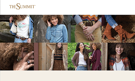
Described as the open-air center for style in Nevada and the Sierra mountains, The Summit offers anytime inspiration for style and flavor. With a mix of fonts and lines like “Hey Reno, it’s good to be here,” the retail destination’s online presence is cool, casual, and contemporary. Representing a shared theme, The Summit is identified by a pair of minimal logos (a compass and a license plate), both of which can be found on its website homepage. Whether hitting the center’s quality collection of retailers or the open road, shoppers are guaranteed to experience finds and firsts.
Although The Summit’s website earns extra points for its look and logo(s), the go-to read wins the top prize for its accessibility menu. Fixed on the right side of the screen, on each page of the site, the feature is noted by a small circular icon of the international symbol for access. A forward-looking form of inclusive practice, the accessibility menu includes a checkmark link to hide v. unhide and the following options: Keyboard nav, cursor, contrast +, bigger text, stop animations, highlight links, legible fonts, read page, tooltips, and page structure. Designed by UserWay, the menu can also be collapsed by pressing CTRL + U.
Beyond exploring options, resetting all, or reporting a problem, the mall encourages shoppers to follow the arrow, join in the fun, and connect via social. Separating itself apart from the competition again, The Summit’s website replaces the standard line of social links with a visually appealing row of recent Instagram snaps. Beyond sending readers to its general social account, the center directly connects shoppers to check out and engage with specific posts.
