Latest Issue

On the Cover
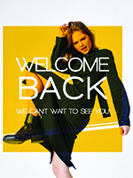
Pandemic Rebound? First Start with a Clean Slate
St. George's freshened up its brand before reconnecting with shoppers whose habits COVID altered.
Resource Directory

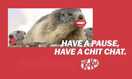
To mark its 85th anniversary, KitKat took its iconic slogan, “Have a break, have a KitKat,” to the next (and literal) level. A Wunderman Thompson agency creation, the digital-first #ABreakForHaveABreak interactive campaign asked fans and followers to generate a soundalike slogan under this hashtag. As one of the world’s most recognized and longest running taglines, pressing pause allowed KitKat to reinforce all that the line stands for and enable it to return refreshed and ready to go for the many more years ahead. Presented with a unique opportunity, the creative team decided to build on a simple and clever idea to use the brand’s most famous property to strengthen KitKat’s message and celebrate the comforting moment.
Bringing together the playful spirit of the brand and the memorable nature of “Have a break, have a KitKat”, the fun and fresh concept of this campaign naturally evolved. While the catchphrase took a mini-break of its own for ten days in October, the team introduced a social media contest featuring a participatory element and an AI online slogan generator. With the minimal concept of this campaign and the context of the KitKat anniversary in mind, the brand aimed to reconnect the public with the name in a meaningful and modern way.
“KitKat is not a brand short of fans or long-term loyalists. This campaign rewarded them with the rare opportunity to have a say and play with [its] most famous brand asset, flex their own creativity, and be part of the brand’s history,” explained Loren Hargreaves, global account lead, Nestlé KitKat, at Wunderman Thompson.
“This campaign sought to bring KitKat closer to its consumers [on] a much more emotional level, bonding them over a shared special celebration beyond the usual impulse buy at the till.”
Activated across multiple social channels, including Facebook, Instagram, Twitter, and YouTube at both a global and market level, this celebratory campaign reached a diverse audience and stimulated vast and varied participation. Throughout the #ABreakForHaveABreak campaign, the company posted daily, motivating users and brands to get involved and using a different tactic to inspire new entries. As part of its central strategy, the team launched an AI bot to provide participants with a little extra help to come up with their submission. A list of big-name brands such as Krispy Kreme, Yorkshire Tea, and Fruit Pastilles participated in this campaign, too, and helped to spread the word. Following the social contest, Jeremy Bullmore, legendary creator and one-time creative director and chairman of J. Walter Thompson, selected the winning entry. The prize: An enviable and anniversary-appropriate 85-hour stay for two at a luxury hotel, all compliments of the KitKat brand.
“[For each day of #ABreakForHaveABreak, KitKat also announced a top slogan as its ‘Pick of the Day’ to recognize the public’s efforts and stimulate further engagement. From these picks, Jeremy Bullmore, being privy to the creation of the original slogan in 1957, was called upon for the deciding vote. His choosing of the selected winner helped to bring the 85-year anniversary full circle, celebrating the old and recognizing the new,” Hargreaves noted.
“Combined with planned brand outreach and PR amplification throughout this campaign, its naturally shareable nature fostered a buzz and continuing engagement without the need for large media investment. In fact, only 4-5 of KitKat’s markets required paid media support behind the campaign assets].” During this time of global uncertainty, many people are experiencing and coping with stress, anxiety, and depression more than ever. With the increase of health and safety measures such as sanitizing, mask wearing, and social distancing, across countries and cultures, individuals are valuing positivity, connectivity, self-care, and “a good old break from it all.”
While snacking on a treat won’t solve the ongoing impact of COVID-19, taking a break can help to establish a more positive mindset.
“In such a world, KitKat will continue to be the champion of breaks, inspiring us within our new-found context, plentiful of digital interaction and virtual connection. Digitalization will continue to be integral to KitKat’s marketing strategy and will only strengthen as our accessibility to the physical world wanes,” Hargreaves added.
“In light of our new cultural reality, many marketing strategies are being explored and designed, but all with the same, ever-important premise to inspire people far and wide to have a break.”
The #ABreakForHaveABreak challenge received a vast amount of attention from the public and fans of the iconic brand:
The purpose of driving all of this engagement was far deeper than a quick injection of sales. Rather, it reinvigorated the KitKat brand’s fundamental purpose and ethos to fans old and new in an interactive way, prompting conversations around a positioning that has stood for decades.
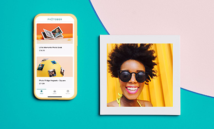
As a fully digital retail service, Photobox transforms favorite moments into beautiful gifts for family and friends. Described as the expert in personalized gifts, the company offers a wide range of products, including photo books and calendars, canvas prints, wall art, mugs, magnets, puzzles, playing cards, and cases. Encouraging individuals to share, connect, and experiment, creativity is the company’s core value.
With the drinking of eggnog, purchasing of presents, listening to seasonal music, and decorating of the Christmas tree, many consumers embraced the holiday season early this year. Looking for a reason to experience a sense of excitement, as a collective, we’re ready to celebrate the end of 2020. With the tradition of baking, mailing, and gift-swapping just around the corner, Photobox’s “Invites, Not Presents” campaign was created for a Christmas like no other. Considered an “optimistic love letter to moments of togetherness,” this campaign is rooted not only in the need for physical touch and human interaction, but also optimism for the future. In collaboration with The Brooklyn Brothers, a fully integrated earned-first advertising agency, the team combined storytelling with digital, social, and experiential marketing to adapt to evolving consumer behavior.
“[Invites, Not Presents reacts to our fundamental need for moments of physical togetherness, which have obviously been greatly restricted throughout this year and the COVID-19 pandemic. This campaign invites people to use Photobox photo printing gifts as pledges to spend more time together. As a canvas for creativity that says ‘let’s do more of this’ to the recipients of Photobox gifts this Christmas],” says a representative of The Brooklyn Brothers.
Elaborating on the holiday spirit of this campaign, as opposed to focusing on the nostalgia of former Christmases, the brand aims to spark new stories and moments of togetherness in the near future and inspire its community to face forward to a time when we can return to living our best life. Since holiday advertising can often be excessively sentimental, particularly in this retail category, Photobox avoids what its team calls classic cliché tropes to reflect the current global and social climate.
A part of Photobox’s overarching theme and tagline, Let’s Go Make Stories, at the center of this campaign’s marketing strategy is a TV placement that describes photographs as invites to more time together and the stories we’ve yet to make. Directed by Saam Farahmand in association with Black Cap Films, and executed by The Brooklyn Brothers, this ad highlights that Christmas is going to look very different this time around. Launched across Europe, the initial public response has been positive, with higher impressions and views than expected and performance metrics on the upside.
“[Working in a COVID-safe environment and with a challenging timeline, Farahmand delivered a strong vision full of energy and scale. The story is a journey through our protagonist’s invitations for the future, the products magically placed in those contexts; it’s a magnificent blend of simple story and technical challenge],” the agency’s representative added.
Targeting a new and younger audience, which traditionally identifies photo printing and gifting as something that members of an older generation does, Photobox tries to capture the relevance of this trend for relationship building and maintaining, especially during this unexpected time. Just one example: Creating a shared recipe book that could be sent to friends, neighbors, and colleagues in a social group to inspire future dinner parties. As demonstrated by Invites, Not Presents, photo books are more than a way to simply capture and re-live memories from previous dinner parties.
Photobox fast-tracked the release of new product innovations such as its photo tiles to place under the tree and respond to the need for more physical reminders of our stories and loved ones around the house. According to The Brooklyn Brothers, by offering consumers digital-first customer service with products of pertinent relevance during a time when people have been unable to purchase in-store, Photobox has helped to support the recovery of the retail industry. In addition to product innovations, this campaign promotes its service innovations, including a recently enhanced digital app and home delivery option.
After flipping the calendar, the modern digital service brand will continue to provide a canvas for creativity and develop a digital-first 360º marketing plan to improve communication and earn the attention of its audience, striving to continually optimize the customer service experience and innovate the product range to meet the needs of a modern audience.
Not yet a subscriber? You can take a look at a sample the newest issue of Trendz here. If you like what you see, subscribe for full access.
Click the frame icon on the reader below to read in full screen. Click the magazine in the reader to zoom in, and press escape to return. You can also use your arrow keys to navigate.
 To view the current issue of Marketing Trendz, please log in and click “read more” below.
Click the image below to read this issue of Marketing Trendz in full screen. Click the frame icon in the reader to zoom in, and press escape to return. You can also use your arrow keys to navigate.
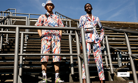
Founded by Marcell Pustul in 2012, MARCELL VON BERLIN uniquely blends couture and modern street style. Capturing the zeitgeist of the fast-moving German capital, the fashion label uses innovative materials and exclusive textiles to create multi-faceted pieces that pair with feminine silhouettes and present the biggest and brightest stars in the entertainment industry.
With an overall visual style based on lines, squares, and rectangles, from the design of its main menu (which is a literal sidebar) to the presentation of its Instagram feed, the website is modern with a capital “M”. Also, the logo of the label. Balancing the urban setting and reflective quality of the main image, which features a diverse group of models sporting fashion-forward glasses, metallic gear, and neon details, the background and bottom of the homepage are made up of neutral tones and natural elements.
An interactive element of the site, the final homepage gallery slide consists of a pair of models and a series of scattered links appearing as tiny “M”s leading to product pages. And it is the small things that make the German/English language site stand out.
For instance, instead of a “Home” tab, the website provides a fixed vertical link of the founder’s name to return to the core of the online source. The visitor can also use a vertical line of three miniature blocks to change the position of the page. Lastly, discovering either the Coutures or Spring/Summer 20 section of the site, the browser will come across a dynamic double slideshow. Although the look, feel, and style of the collections are totally different, the background of both slideshows features the site’s signature elements: lines, shapes, and order, photographing books and bookshelves, and open lockers and floor tiles, respectively.
