Latest Issue

On the Cover

Pandemic Rebound? First Start with a Clean Slate
St. George's freshened up its brand before reconnecting with shoppers whose habits COVID altered.
Resource Directory

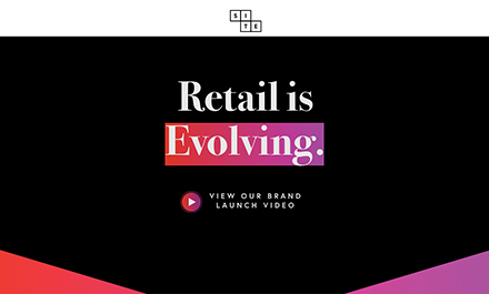
Formerly known as Developers Diversified Realty Inc., SITE Centers Corp. is a publicly traded REIT that invests in centers across more than 30 American states and Puerto Rico. Simple, strong, and stark, its website—more specifically, its homepage— offers a sense of character within its details. The print is clean, the imagery basic, and the design modern in a way that grabs and holds the attention of the visitor.
Balancing black and white vs. a mix of pink and purple, the site captures the perfect pop of color. Scroll down the lengthy homepage and letter-by-letter keywords are highlighted with black vs. color backgrounds, lines expand horizontally across the screen, dots expand vertically down the screen, and graphics zoom in and out or change color.
Exchanging a main menu for a barely-there header, the top line shows a trio of click options: A vertical menu, a brand logo, and a “Latest Supplement” tab to access the latest quarterly financial details available. The homepage opens with the statement, “Retail is Evolving,” and a link to the group’s launch video, which features a sit-down interview with president and CEO, David Lukes. He touches on adapting to the cultural shift within the retail industry and changing the brand identity as a response. He notes that the switch in name, logo, and identity reflects who the SITE Centers team wants to be in the future.
“I would say that our new brand is a little edgy. It changes, it moves; the colors move, the shapes move. They’re squares, squares are the building blocks of most everything we do,” he explained.
“What we are going to do is challenge the existing assumptions of the rest of our industry.” The same could be said of the company’s website.
