Latest Issue
On the Cover
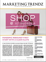
Pandemic Rebound? First Start with a Clean Slate
St. George's freshened up its brand before reconnecting with shoppers whose habits COVID altered.
Resource Directory
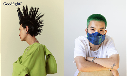
At first glance, Goodfight’s homepage reads like a magazine. As if flipping the pages of print or swiping a digital one, its page automatically moves in a horizontal direction (R-L) showing diverse faces, non-traditional hairstyles, androgynous looks, simple scenes, as well as switching from urban to nature feels. Located in the bottom right corner is a pair of square-shaped little icons that allow the visitor to swap from full page to long line (or a conveyor belt design) of all the same photos. With each snapshot serving as a link, the visitor has the option to check out lookbooks, previews, and visual editorials dating back to 2018.
With no brand story or history included on the site, it requires a shallow online dive to learn more about the Los Angeles-based fashion lifestyle brand and creative studio. The online shop looks like a clean collage or fashion-forward Instagram feed. Move the cursor from one “post” to the next and the user will see a slight change of presentation of the product and its name and price appear. The visitor can either casually browse a mix of the collection under the “New Arrivals” section or shop by PPE, outerwear, knitwear, tops, bottoms, jewelry, accessories, objects, and gift cards, among other categories.
A trio of main menu tabs worth a shout out: “Archive”, “Good Life” and “Mood.” The first offers a unique way of exploring Goodfight’s lookbooks and editorials via snapshots, links, vertical and horizontal navigation, and creative design. The second leads to an introduction and a list of a dozen names that represent an ongoing conversation (interview style) with community members. Made up of photos, illustrations, clips, videos, moving images, and memes, the third displays a diverse collection of creative content arranged by date.
